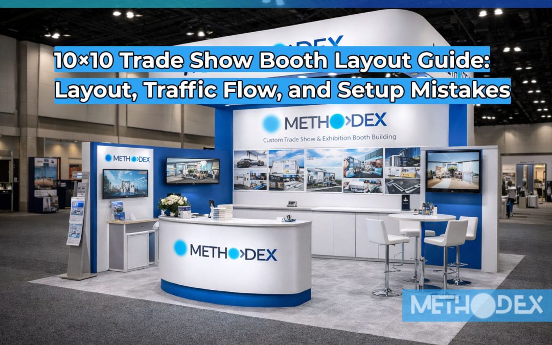
Everything About 10×10 Trade Show Booth Layout, Traffic Flow, and Setup Mistakes
If you’ve ever walked a busy expo floor, you already know the truth: a 10×10 booth can either feel like a magnet or a speed bump. Same square footage, wildly different results. The difference almost always comes down to layout, How you use your space, guide foot traffic, and avoid the little setup mistakes that quietly kill conversions.
To View Full List of 10×10 Trade Show Booth Layout Product and design click one the link given
Table of contents for this 10×10 Trade Show Booth Layout Guide
- What this 10×10 Trade Show Booth Layout Guide covers
- The goal of a 10×10 layout (it’s not “fill the space”)
- 10×10 booth dimensions, zones, and workable clearances
- Traffic flow types: passersby, browsers, and buyers
- The 3 layout models that work in nearly any industry
- Counter placement rules that protect your conversations
- Product placement rules that prevent “visual noise”
- Lighting and visibility decisions that affect traffic
- Demo strategy inside a 10×10
- Setup mistakes that cost you leads
- A practical 10×10 setup timeline for show week
- Checklist and measurement table you can use every time
- FAQs
What this 10×10 Trade Show Booth Layout Guide covers
This 10×10 Trade Show Booth Layout Guide focuses on the “engineering” side of a small booth: where to place your counter, how to keep a clean entry path, how to create a natural stop point, and how to set up so your staff isn’t trapped behind furniture. You’ll also learn how to think about traffic like a real-world system: people slow down, glance, stop, and either enter—or they don’t.
layout in 10×10 Trade Show Booth Layout Guide
Most exhibitors make the same mistake: they treat a 10×10 like a storage unit. They try to “fit everything.” The result is a booth that feels cramped, confusing, and awkward to enter. People hesitate at the edge because there’s no obvious path forward.
In this 10×10 Trade Show Booth Layout Guide, the goal is simple: create a booth that does three jobs in this order:
- Signal what you do in 3 seconds
- Invite people in without friction
- Support a conversation, demo, or lead capture without chaos
A good 10×10 layout is not about filling the square. It’s about controlling what people notice first, where they stand, and how you move them from “curious” to “engaged.”
remember your trade show booth is sales tools for your Business!
Booth dimensions and zones for 10×10 Trade Show Booth
A 10×10 booth gives you 100 square feet, but you never truly “own” the full 100 the way you imagine. You lose functional space to:
- counter depth
- product display depth
- staff standing area
- storage (even small bags add up)
- the entry path (this matters more than people think)
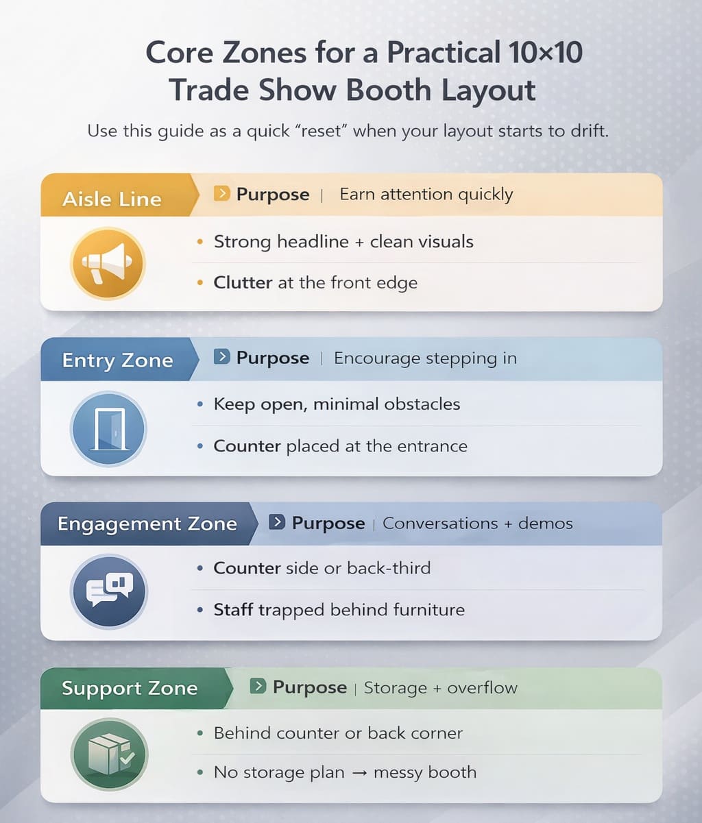
Think in zones. This 10×10 Trade Show Booth Layout Guide uses a simple zoning method you can repeat at any event:
- Front edge (Aisle Line): where attention is won or lost
- Entry zone: the first 2–3 feet inside the booth
- Engagement zone: where conversations happen
- Support zone: storage, extra collateral, personal items
When you plan a 10×10 layout, start by protecting the entry zone. If your entry zone is blocked by a counter, a demo table, or tall product racks, you’re forcing visitors to make a decision before they feel comfortable. Most will keep walking.
you can find more idea of 10×10 Trade Show Booth design in this post also
Core zones for a practical 10×10 Trade Show Booth layout
Traffic flow types in this 10×10 Trade Show Booth Layout Guide
Every booth gets three kinds of traffic. If you design only for one, you miss the others.
1) Passersby
They are scanning. Their pace is fast. Your layout must be readable instantly. For passersby, your layout’s “front face” matters more than what’s inside.
2) Browsers
They slow down and look. This is where the layout needs a low-friction entry. Browsers don’t want to feel trapped or pressured. If the booth looks too enclosed, they keep moving.
3) Buyers
They are seeking. They have a problem, a budget, and a timeline. Buyers need a clear place to talk—without shouting over aisle noise and without standing in the flow of traffic.A layout that wins creates a path for browsers and a “conversation pocket” for buyers. That’s the heart of this 10×10 Trade Show Booth Layout Guide.
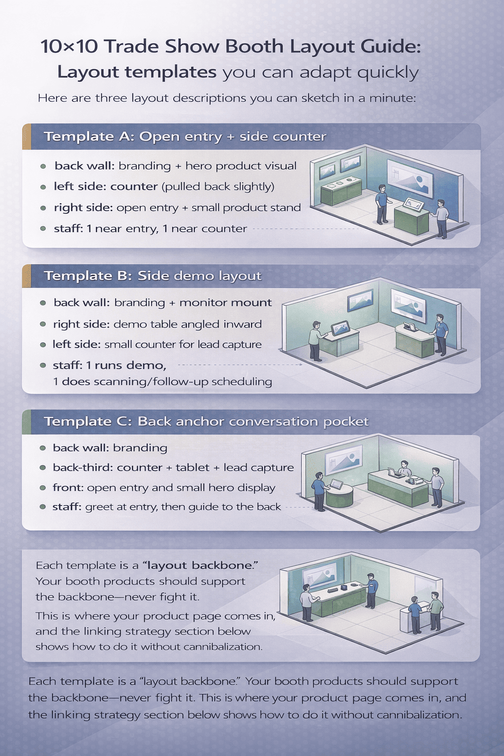
Triangle 10×10 Trade Show Booth Layout Model
You don’t need 20 layouts. You need a few reliable models you can adapt. These are the workhorses.
Model 1: The “Open Corner” layout for 10×10 Trade Show Booth
This is the best all-around layout for foot traffic. It keeps the entry open and creates a natural stop point.
How it works:
- Counter goes to one side (not centered)
- Back wall carries the brand message
- The opposite side stays open for entry
- Lighting focuses attention on the back wall + hero product
Why it performs:
Visitors can step in without committing to a conversation immediately. Staff can greet without blocking the aisle. And the booth doesn’t feel like a barrier.
Model 2: The “Side Counter + Demo” layout for 10×10 Trade Show Booth
This layout is built for live demos, tablets, or product handling—without turning your booth into a crowd jam.
How it works:
- Counter placed along one side wall
- Demo surface faces inward at a slight angle
- Staff stands beside (not behind) the counter
- Back wall stays clean and message-forward
Why it performs:
Demos happen inside the booth, not in the aisle. People gather along the side, leaving an open entry.
Model 3: The “Back Anchor” layout for 10×10 Trade Show Booth
This is for exhibitors who need calm conversations and a more premium look.
How it works:
- Back wall acts as the “anchor” (big branding)
- Counter is placed deeper into the booth (back-third)
- Front stays open and inviting
- Lighting pulls visitors toward the back
Why it performs:
It creates a natural “pull” into the booth. Visitors step inside, and the conversation happens away from aisle chaos.
Booth Layout Guide: Counter placement rules that protect conversions
Counters can help or hurt. In a 10×10, the counter is more than furniture—it controls movement.
Rule 1: Never block your entry with a counter.
If the counter sits across the front, you’ve turned the booth into a wall. People don’t “enter walls.”
Rule 2: Put the counter where it creates a pause, not a barrier.
Best spots: left or right side, slightly back from the aisle line.
Rule 3: Staff should stand beside the counter, not trapped behind it.
Standing behind a counter sends a “wait in line” signal. Standing beside it signals “welcome.”
Rule 4: Keep counter surfaces clean.
A cluttered counter is visual noise. It also invites “freebie hunters” who never convert.
if you want to have budget 10×10 trade show Booth you can read this post,
Product placement rules to prevent visual noise in Layout
If you sell physical products, it’s tempting to show everything. The booth becomes a mini showroom. In a 10×10, that often backfires.
Use the “hero + support” method:
- Hero product: the one thing people should remember
- Support items: a small set that reinforces the story
Place the hero where the eye naturally goes: back wall center, or a lit pedestal just inside the entry. Put support products where browsers can explore without blocking traffic.
Don’t stack products at the front edge.
It looks busy from the aisle and reduces the “inviting” feel.
If you want a dedicated guide to merchandising in small spaces, keep that on your existing budget page. This 10×10 Trade Show Booth Layout Guide focuses on how placement affects flow, not on budget shopping lists.
10×10 Trade Show Booth Layout Guide: Lighting choices
In small booths, lighting is leverage. A booth with good lighting looks larger, cleaner, and more premium—even if the footprint is identical. if you know the true meaning of trade shows you know that art of presentation with booth is all you need to master.
What lighting does in a 10×10 layout:
- directs attention to your back wall messaging
- makes your booth visible from farther away
- highlights the hero product without adding clutter
- reduces the “flat” look that fabric walls can get under harsh hall lighting
Simple lighting strategy:
- 2 focused lights on the back wall
- 1 focused light on the hero product
- optional soft fill light near the counter
If your 10×10 feels “invisible,” lighting is usually the reason. This 10×10 Trade Show Booth Layout Guide recommends lighting because it supports layout performance—not because it looks nice in photos.
Demo strategy without blocking the aisle
Demos work when the booth is built for them. In a 10×10, the wrong demo position creates a crowd right at the aisle line. People stop, the aisle clogs, and show staff gets annoyed. Worse: real buyers avoid the congestion.
Better demo approach:
- angle the demo inward
- keep the “viewer line” inside the booth
- give people a clear standing spot so they aren’t guessing where to stand
- avoid loud audio that pushes visitors away
A practical rule from this 10×10 Trade Show Booth Layout Guide:
If a person can watch your demo while standing in the aisle, your layout needs adjustment.
You want them inside—comfortable, engaged, and close enough to talk to.
Common Setup Mistakes in 10×10 Trade Show Booth Layout
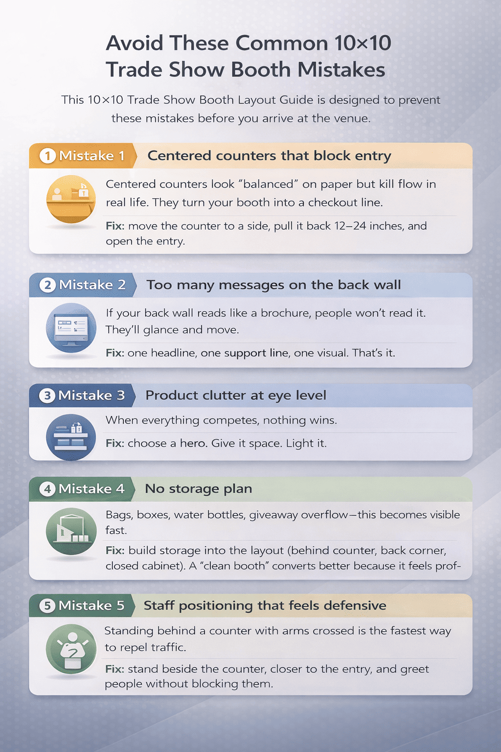
Mistake 1: Centered counters that block entry
Centered counters look “balanced” on paper but kill flow in real life. They turn your booth into a checkout line.
Fix: move the counter to a side, pull it back 12–24 inches, and open the entry.
Mistake 2: Too many messages on the back wall
If your back wall reads like a brochure, people won’t read it. They’ll glance and move.
Fix: one headline, one support line, one visual. That’s it.
Mistake 3: Product clutter at eye level
When everything competes, nothing wins.
Fix: choose a hero. Give it space. Light it.
Mistake 4: No storage plan
Bags, boxes, water bottles, giveaway overflow—this becomes visible fast.
Fix: build storage into the layout (behind counter, back corner, closed cabinet). A “clean booth” converts better because it feels professional.
Mistake 5: Staff positioning that feels defensive
Standing behind a counter with arms crossed is the fastest way to repel traffic.
Fix: stand beside the counter, closer to the entry, and greet people without blocking them.
Mistake 6: Ignoring the “first 3 feet”
The entry zone is your invitation. If it’s cluttered, people won’t step in.
Fix: keep the first 3 feet open. Let visitors enter without bumping into stuff.
This 10×10 Trade Show Booth Layout Guide is designed to prevent these mistakes before you arrive at the venue.
if you are interested more about trade show booth design you can read this post
10×10 Trade Show Booth Layout Guide: A setup timeline
A clean setup is part of layout performance. Rushed setups lead to messy booths.
2–4 weeks before the show
- finalize your layout model (choose one of the three)
- confirm booth rules: height limits, power access, aisle restrictions
- decide what you’re actually displaying (hero + support)
1 week before the show
- do a “dry run” setup in an office or garage
- time yourself
- mark where each item goes
- identify what feels crowded and adjust
Show day
- build the back wall first
- set lighting before placing products
- place the counter and confirm entry openness
- then add products and collateral last
- keep the front edge clean
This 10×10 Trade Show Booth Layout Guide approach prevents the classic mistake: placing furniture first and then forcing everything else to fit.
10×10 Trade Show Booth Layout Guide: FAQs
1) How do I choose the best 10×10 layout?
Start with your primary goal: demos, lead capture, or conversations. Then choose one of the three layout models in this 10×10 Trade Show Booth Layout Guide. If you’re unsure, use the “Open Corner” layout because it supports the widest range of traffic types.
2) Where should the counter go in a 10×10 booth?
Usually on the left or right side, slightly back from the aisle line. The key is keeping the entry zone open. Counters that block the front reduce entry and reduce conversations.
3) How do I prevent traffic from bunching up in front of my booth?
Angle demos inward, keep giveaways from the front edge, and avoid forming a “line” at the aisle. Your booth should invite people in, not stop them outside.
4) What’s the fastest way to make a 10×10 booth feel bigger?
Open entry zone, clean back wall message, and strong lighting. Removing clutter often does more than adding new display elements.