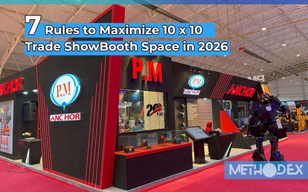
The 10×10 Booth Display Paradox: Why “Smaller” Is Harder?
There’s a dangerous misconception in the trade show industry that you need a 20×20 island booth to make a serious impact. This is mathematically incorrect. Interestingly, some of the highest lead generation rates per square foot occur in these 10×10 inline booths.
But here’s the thing: there’s no room for error with a 10×10 booth.
To View Full List of 10×10 Trade Show Booth Layout Product and design click one the link given
In a large island booth, you can hide a messy cable, a confused employee, or a messy desk in a corner. But in a 10×10 space, there are no corners to hide. You have exactly 9 square meters of space and about 3 seconds to answer the visitor’s subconscious question: “Does this work for me?” Most exhibitors fail this test because they treat a 10×10 booth like a “shrunken model” of a large booth. They try to cram too many products, long texts, and bulky furniture into it. The result is what we call the “Garage Sale Effect”; a cluttered, cluttered space that sends a “cheap” signal to the customer’s brain instead of a “market leader.” This guide isn’t about “decorations”; it’s about spatial strategy. We’ll dissect the 7 architectural and psychological rules that Fortune 500 brands use to make small spaces look luxurious, spacious, and irresistible.
7 Rules to Maximize 10×10 Booth Space in 2026
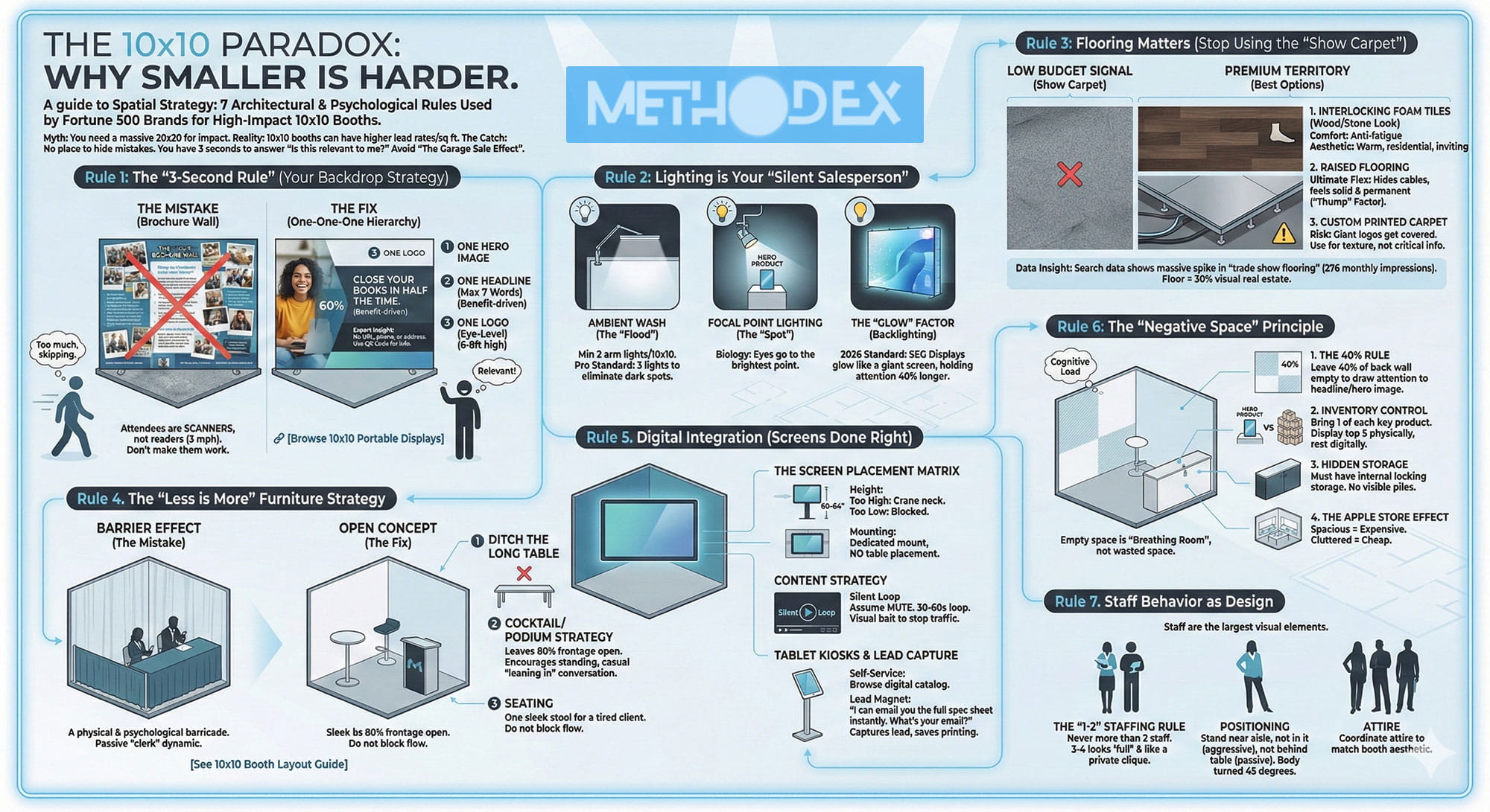
Rule 1: 10×10 Trade Show Booth 3-Second Rule
The biggest mistake in 10×10 design is treating the wall behind you like a brochure. Marketing managers often feel like they have to “go big” and fill every inch of the graphic with a feature list, mission statement, and contact information. The harsh reality: People walking down the aisle aren’t “readers”; they’re “scanners.” They’re moving at 3 miles per hour, processing information. If understanding your work requires them to stop and read, you’ve lost them.
The Hierarchy of Visual Attention in Booth
To pass the 3-Second Rule, your backdrop must follow a strict “one-one-one” hierarchy. Break this rule and your design will become white noise.
1. A Hero Image in your Trade Show Booth
You need a single, high-quality image that shows the result of using your product, not just the product itself.
Wrong: A collage of 10 small images that show all the features.
Right: A dominant image that fills 60% of the field of view. If you’re selling software, don’t include a screenshot of a dashboard (it’s boring from 10 feet away); include a picture of someone who is relieved or successful because of using your software.
2. A headline of 10×10 Trade Show Display (7 words max)
Your headline isn’t meant to be descriptive; it’s meant to “hook.” It should tell the benefit, not the feature.
Weak: “Provide integrated cloud accounting solutions for small businesses.” (Too long, too technical).
Strong: “Close accounts in half the time.” (Benefit-oriented, immediately understandable).
3. 10×10 Trade Show Booth logo (at eye level)
Where you place your logo is as important as the logo itself.
The “footer” trap: Many designers place the logo at the bottom of the design. This is a disaster. As soon as a desk or employee stands in front of the wall, the bottom 120 cm of your wall is blind.
The “sky” zone: Your logo should be in the top 25% of the structure (about 180-240 cm from the ground). This ensures that it can be seen from three aisles away and above the heads of the crowd.
Expert tip: Don’t write your website address, phone number, or office address on the wall. In the age of smartphones, no one writes down numbers off the wall. Your wall is for brand engagement, not a phone book. For more detail guide you can read Highlighting product with 10×10 trade show booth.
Rule 2: Lighting in your 10×10 Booth
Your “Silent SalesPerson”
If you walk into a luxury jewelry store, what do you see? The lighting is bright, focused, and intentional. Now walk into an auction warehouse; the light is flat, yellow, and dull.
Most 10×10 exhibitors rely entirely on the exhibition hall’s general lighting. This is a fatal mistake. Hall lights are usually mounted 10 feet high, casting ugly shadows on your staff’s faces and dulling your graphics.
3 Layers of Booth Lighting
To make a small booth look expensive, you need to control the lighting.
-
Clean Back Wall
You need to “wash” the back wall with clean, white light.
The tool: LED arm lights mounted on top of the frame.
Rule: You need one light for every 4 to 5 feet of wall width. For a 10×10 booth, a minimum of 2 lights is required; 3 is the professional standard to eliminate dark spots.
Light Temperature: Be sure to use Cool White (5000K). This light is similar to daylight and brings out colors. Warm light makes white graphics look dirty.
-
Spotlight of your 10×10 Booth
If you have a physical product, it should be the brightest object in the booth.
Use a spotlight that is focused precisely on your hero product. The human eye is biologically programmed to look at the brightest spot in the room.
-
Backlighting Factor
This is the 2026 standard for premium booths.
Fabric Lightboxes (SEG): In this technology, LED strips are placed inside the frame and behind the fabric. The result is a graphic that glows from the inside, like a giant phone screen.
Why does it win? Research shows that backlit displays hold 40% more attention than regular banners. In a sea of dull banners, a bright wall acts as a beacon.
Rule 3: Flooring Matters in 10×10 Booth
Look down. What do you see? If you see the same thin, shaggy gray carpet that the exhibitor saw, you’ve sent the “low budget Booth” signal before you even say hello.
Floor Psychology: Flooring is the unconscious boundary of your “territory.” When a customer steps from a hard concrete hallway onto your custom flooring, they physically feel the change. They slow down. They’re “in your home” now. Read More About Trade show booth flooring i this post.
Best Options for 10×10 Booth Floor
1. Foam Puzzle Tiles (Wood or Stone Pattern)
This is the secret weapon of seasoned exhibitors.
Comfort: These act like anti-fatigue mats. Your employees are on their feet for 8 hours. Hard concrete saps their energy and morale. Soft foam keeps them energized and smiling.
Beauty: A “dark walnut” wood-look tile instantly warms up the space, giving it an inviting, residential feel rather than a cold, office feel.
2. Raised Flooring
If you’re on a budget, raised flooring (2-3 inches high) is the ultimate powerhouse.
Cable Management: Allows you to run HDMI and power cables from under the floor to anywhere in your booth, eliminating unsightly tape on your carpet.
Solid Feel: The sound of footsteps feels solid and permanent.
Data Insights: Our search data shows a huge spike in searches for “exhibition flooring.” Exhibitors are realizing that the floor is about 30% of their total visual space. Don’t leave it empty.
Rule 4: The “Less is More” Furniture Strategy
We see this tragedy at every trade show: a company rents a 10×10 booth and then blocks the entire front of the booth with a 6-foot table (with a cloth tablecloth).
The “Barrier Effect” in Booth
Placing a long table at the entrance to the booth creates a physical and psychological barrier. It screams, “Don’t come in, I’m protecting my stuff.” It forces your employees to sit at their desks (and often play with their phones under the desk) and play the role of “passive secretary” instead of an “active consultant.”
“Open Concept” Layout
To maximize a 10×10 space, you need to remove barriers and invite entry.
1. Ditch the long table
Get rid of that 6-foot table altogether. It takes up 15-20% of your floor space and serves no strategic purpose other than to collect clutter.
2. Podium/Cocktail Table Strategy
Replace the large table with a slim cocktail table or a branded counter and place it off-center (corner or side).
Function: A place to put a tablet, notebook, or water bottle.
Flow: Leaves 80% of the front of the booth open.
Psychology: A standing table encourages people to stand and “come closer” for a chat, which is more like a friendly conversation in a cafe than a formal sales presentation.
Rule 5: Digital Integration for 10×10 Booth
In 2026, the stationary booth will look old-fashioned. You need to move. But installing a TV in a 10×10 booth is awkward.
Display Placement Matrix
Height: The center of the screen should be at eye level (about 150-160 cm).
Too high: neck pain; won’t look.
Too low: blinded by people standing in front of it.
Installation: Don’t put the TV on a table (looks amateurish). Use special monitor stands or wall mounts (VESA Mounts) to give it a “floating” feel and a sense of integration.
Content Strategy: “Silent Loop”
You should assume your video is playing on mute. The exhibit hall is noisy.
Solution: Create a 30-60 second looping video that relies on animated typography (large text) and high-contrast images. Caption everything.
Purpose: The display isn’t for closing deals; it’s to stop the passerby so your employee can talk to them. It’s “visual bait.”
Tablet Kiosks and Lead Generation
Paper brochures are the enemy of a clean booth. They’re messy and expensive to carry.
Tablet move: Mount an iPad on a stand.
“Lead magnet”: Instead of handing out a brochure, say, “I can email you the full catalog right now. What’s your email?” This instantly captures the lead in your CRM and eliminates printing costs.
Rule 6: The Principle of Negative Space
This is the hardest rule for marketing managers to accept. Empty space is not wasted space; it is “breathing space.”
In a small 10×10 booth, if you fill every wall with text and every corner with product, the human brain will experience “cognitive load.” When the brain is bombarded with too much stimulus, the instinct is to run away.
How to apply the negative space strategy:
The 40% Rule: Try to leave 40% of the back wall blank (just background color or texture). This will direct the eye to the elements present (the headline and main image).
Inventory Control: Don’t bring 50 boxes of product to the show. Bring only 1 of each key product. If you have 50 models, display the top 5 physically and the rest digitally on a tablet.
Hidden Warehouse: In a 10×10 booth, you don’t have a back room. You need a counter or podium with a built-in locker to hide staff bags, water bottles, and gifts. Nothing ruins a design faster than seeing a pile of jackets and bags in the corner of the booth.
The Apple Store Effect: Think Apple Store. Big tables. Lots of space. Few products. It feels expensive. Now think of a $ 1-everything store. Crowded. Full of stuff. Narrow aisles. It feels cheap. What brand experience do you want?
Rule 7: Employee Behavior as Part of the Design
You might be asking, “What does the employee have to do with the booth design?” Everything.
In a 10×10 booth, your team members are the largest visual elements in the space. They take up space, block sightlines, and create the “vibe.”
The “1-2” Staffing Rule
Maximum: Never have more than 2 people in a 10×10 booth at a time.
Why? If you have 3 or 4 people, the booth will look “full.” No visitors will enter a booth that is physically filled with employees. It will feel like a private gathering.
Standing: Stand near the aisle, but not in the aisle (which is aggressive) or behind a table (which is defensive). Stand in the corners, at a 45-degree angle to the flow of traffic.
Attire: Your team is part of the color palette. If your booth is modern, black and red, and your employees are wearing canary-yellow shirts, you’ve broken the design. Match the clothing to the booth aesthetic.
Summary: 10×10 Trade Show Booth Design is about intention
Designing a high-converting 10×10 booth isn’t about spending the most money; it’s about making the smartest decisions.
10×10 Booth Bad design: Busy walls, dark lighting, obstructed tables, too many staff, dangling wires.
10×10 Booth Good design: A clear message, bright LEDs, open flooring, breathing space, and hidden storage.
By following these 7 rules, you’ll transform your 10×10 space from a cramped “booth” into a professional “showroom.” You’ll no longer look like a small business struggling to survive, but like an industry powerhouse poised to thrive.
Ready to upgrade your look?
Now that you know the design rules, you need the tools to implement them. 1. Choose your structure: Check out the options in [Compare 10×10 Booth Types]. 2. Grab the equipment: Check out our curated collection of [10×10 Exhibition Booth Layout]. 3. Need inspiration? Browse our gallery of [50+ 10×10 Exhibition Booth Ideas].
Your next trade show is your chance to dominate the hall. Design accordingly.
10×10 Design FAQ
Q: How big should the font be on a 10×10 wall?
A: A rule of thumb is 2.5 cm of text height for every 3 meters of viewing distance. Since you want your headline to be readable from the aisle (3-6 meters away), the main text should be at least 5-8 cm high.
Q: Can I use a regular TV stand in a 10×10 booth?
A: Yes, but floor space is gold. A better option is to use structural mounts that attach directly to the wall frame. This floats the screen and keeps the floor open for people to stand.
Q: What is the best color for a 10×10 booth?
A: Light colors (white, light gray) make the space appear larger. Dark colors (black, navy) make the space smaller but more “luxurious” and intimate. Avoid busy patterns or neon colors as a background, as they distract from the product.
Q: Where should I put the giveaways?
A: Don’t throw them in a big bowl on the front table for everyone to pick up as they pass by. Hide them in a cupboard or podium. The giveaway should be a reward for a conversation, not a handout to passersby. This will both save you money and improve the quality of your leads.